Kittery Airbnb: A Case Study on Design
Note to reader: You’ll learn from this post. Hopefully you’ll laugh (the backsplash chronicles). I am using this as a “case study”, if you will, on how to make improvements in your own spaces for the better. This should be helpful if you are thinking of doing an Airbnb/short term rental, if you feel like your space isn’t quite right, if you need a little push to add color to your life, if you have a spot that you don’t know what to do with. So, read on.
Professional photos done by http://www.seacoastrephotography.com
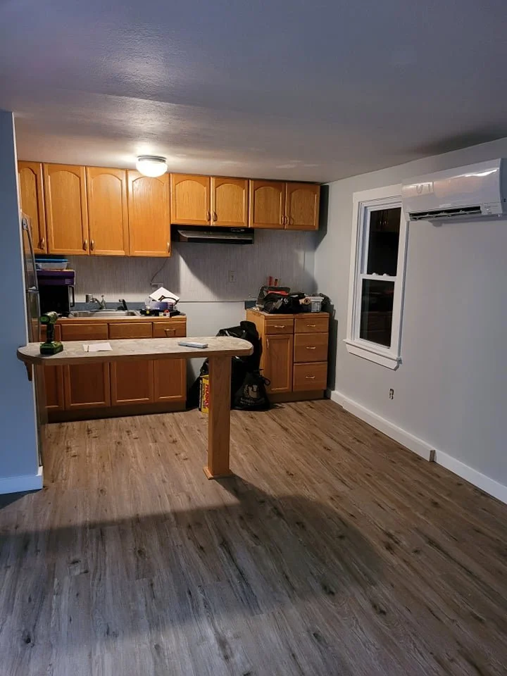
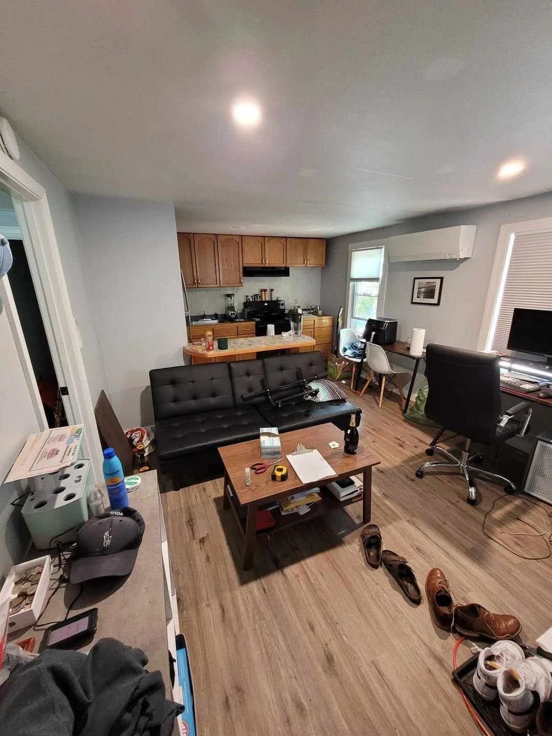
Before photo
When I first received this photo of that would-be Airbnb, I immediately had… questions. There were a few things that stood out to me:
There are no defined spaces i.e. the different “rooms” in this open floor plan are not separate.
The small, weird-shaped island here doesn’t make sense (see it behind the futon).
The blank wall behind the couch is a missed opportunity (it’s the first thing you see when you walk in - this photo was taken from the entrance).
The second small wall-cabinet in the kitchen (on the right) breaks the established horizontal “lines” for the kitchen (i.e. creates an awkward gap where there shouldn’t be one.
The backsplash is just ugly.
Lack of window treatments (curtains add so much to a space).
The list goes on…
These were my solutions:
#1 resolution: Use rug(s) and a new floor plan to define different areas. Most importantly, the living room. I also wanted to add a runner in the kitchen (be nice to your feet on a cold morning).
Note the rug in the living room area and runner in the kitchen for space definition.
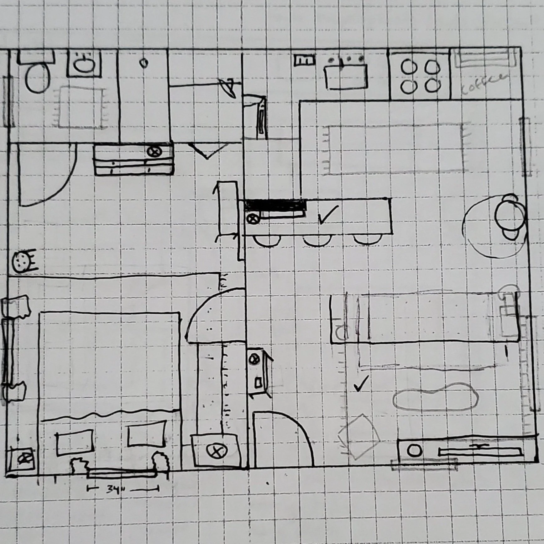
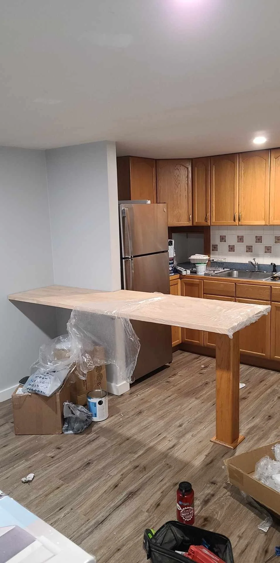
#2 resolution: The old island had to go. Plus, there was a huge missed opportunity with the blank wall. My plan; to remove the island top, build a new top that extends all the way to the left wall, which allows us to add more seating. This area is now the dining table and/or desk area for guests. They can even bring a seat around the other side if they want to face each other while eating. The easiest solution; butcher block custom cut to hug this half-wall that hides the side of the fridge.
The old island is in black and the new plan in red.
Before and after of island update.
#3 resolution: Add a large framed art piece on this blank wall, above the new island. Add a little vignette (maybe a lamp or plant and something else… a tray with coasters or napkin holder). Vignettes should be in groups of three. Three items that are varying heights to add a layered look without feeling cluttered.
Fun, energetic, LARGE art piece.
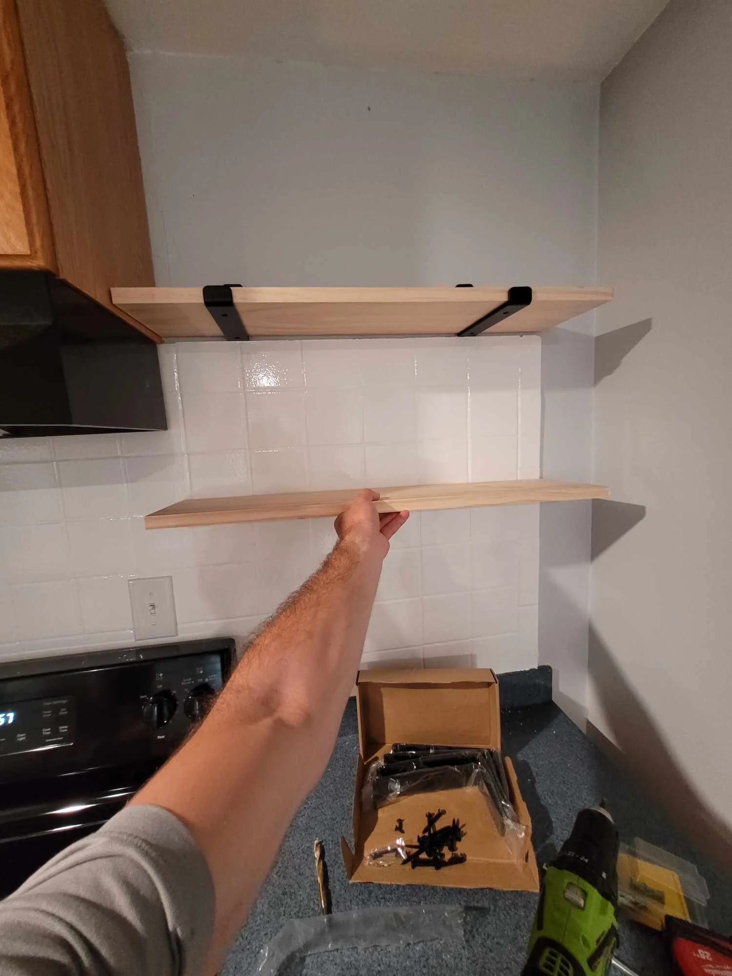
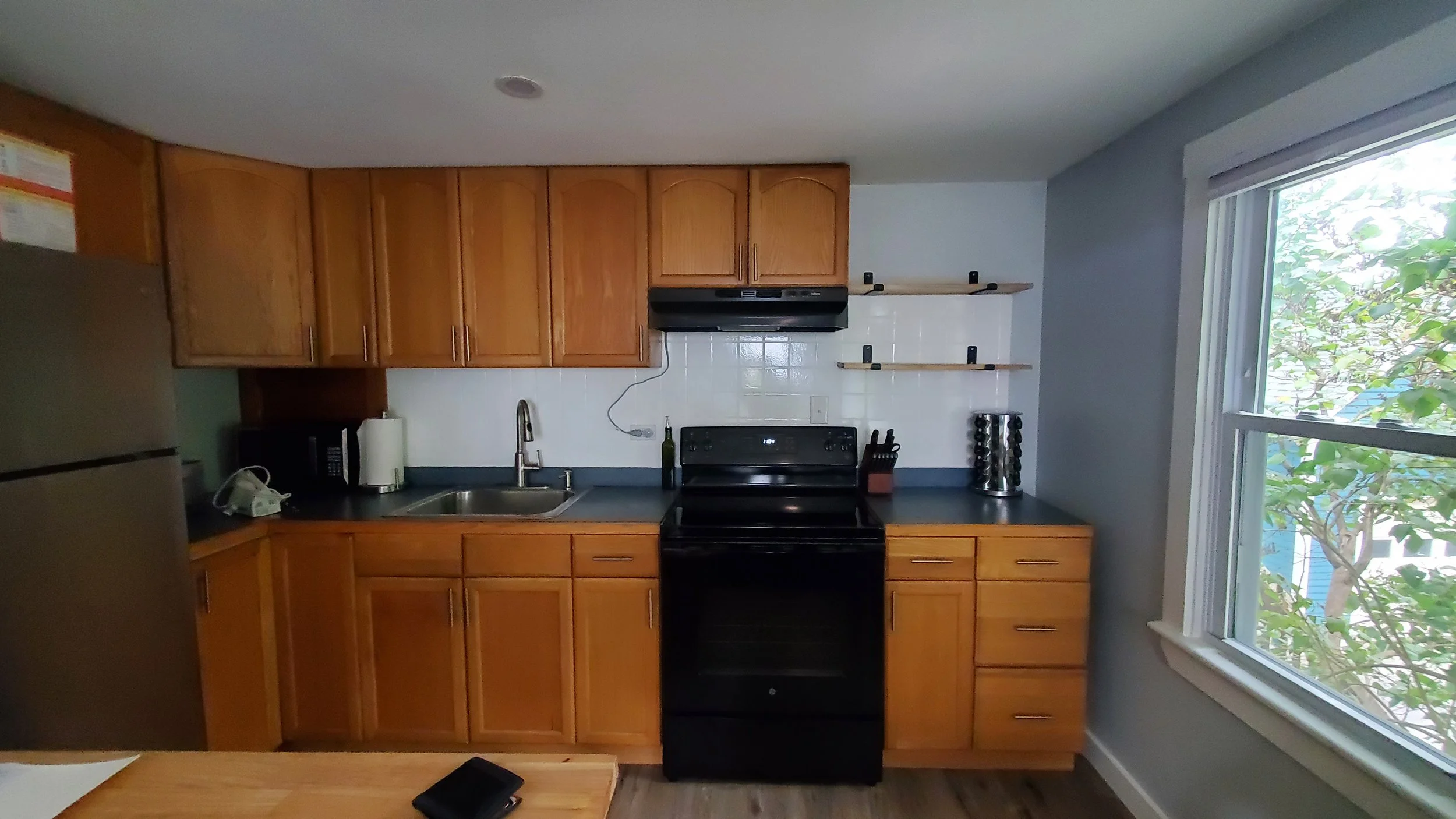
#4 resolution: The second small wall-cabinet in the kitchen (on the right) needed to be removed. We would replace it with two floating shelves. The bottom shelf should line up with the rest of the cabinets in the kitchen.
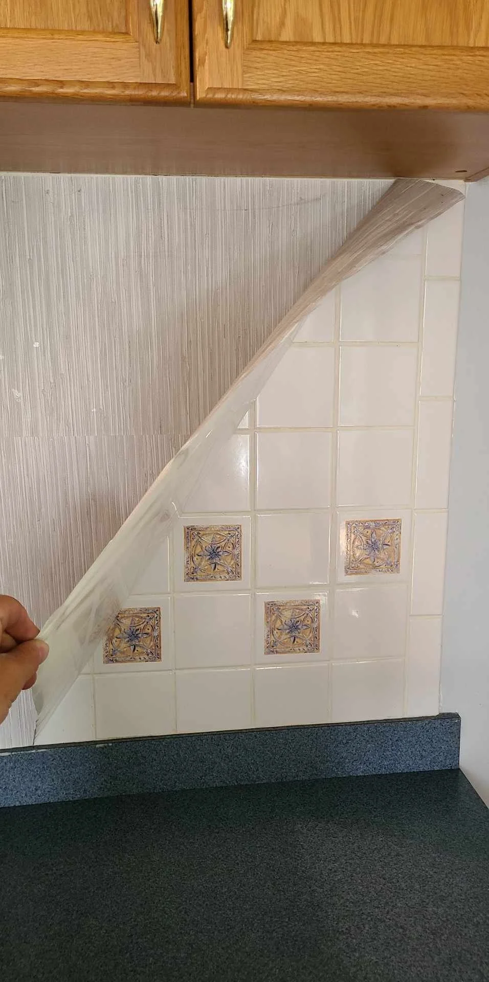
#5 resolution: THE BACKSPLASH… what a journey. What I originally assumed was wallpaper (I was right) over just walls (I was wrong) turned out to surprise us all.
YEAH. The ugly wallpaper was ON TOP of even uglier tile. The original plan was to remove the wallpaper and add peel-and-stick tile. The new plan was to remove the wallpaper and paint the existing tile white. They sell kits at local hardware stores to do this. Just… look.
You ugly.
Much better. Crisis averted.
#6 resolution: This is where we add curtain rods - high and wide. This always makes a space feel larger than it is, plus gives you the opportunity to add texture. And privacy.
BOOM BABY
#7 resolutions: There are many other things wrong with this photo. I’m going to make a list here for your reference. Use this information in your own spaces:
Having a large piece of furniture close to the entrance is a NO GO, makes the space feel small and cramped.
Having furniture blocking the windows (the computer/desk in the original photo). This is never a good idea. Natural light is king.
Instead of storing your shoes in the middle of the room for everyone to trip over, make space for the wall to the left.
The tiny framed art under the heat pump is not large enough for that wall. Art should fill the space and be the same shape as the wall it will be hung on in order to be the right scale.
Lack of diverse textures and colors. For this space, I wanted it to feel fun and upbeat, yet comfortable and minimal. In this original photo, you can see that there are not many colors or different textures. I changed that.
Since we were not altering the cabinets in any way, we needed to make them feel less… yellow. I used a trick of color.
Ordered some gold/champagne bronze hardware, which are yellow, to make the cabinets feel more high end and less-yellow by comparison.
How did it all turn out?
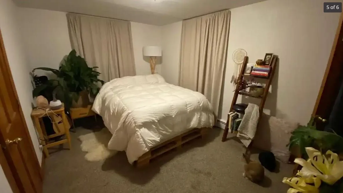
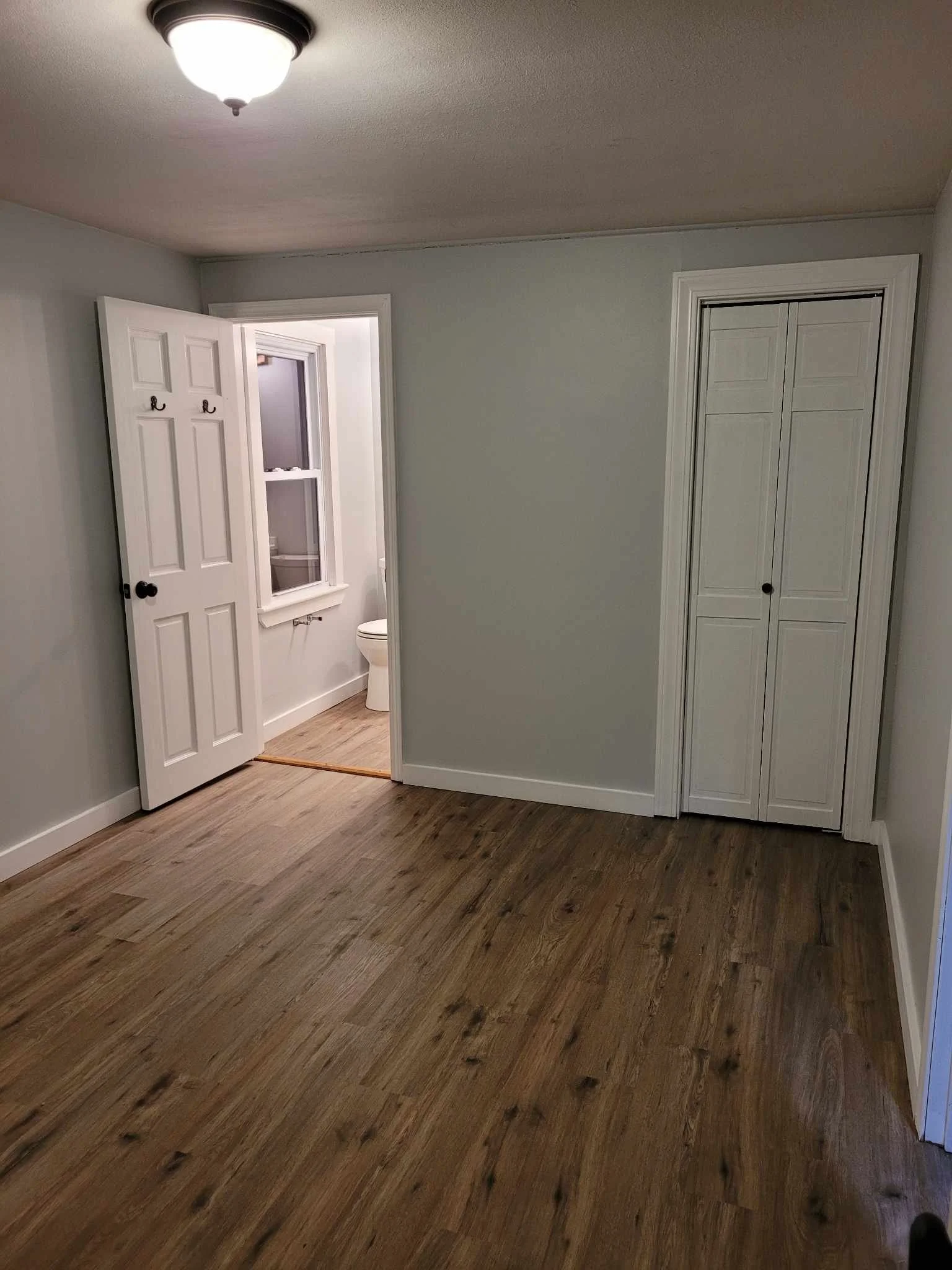
And just for fun, some side-by-sides of all rooms:
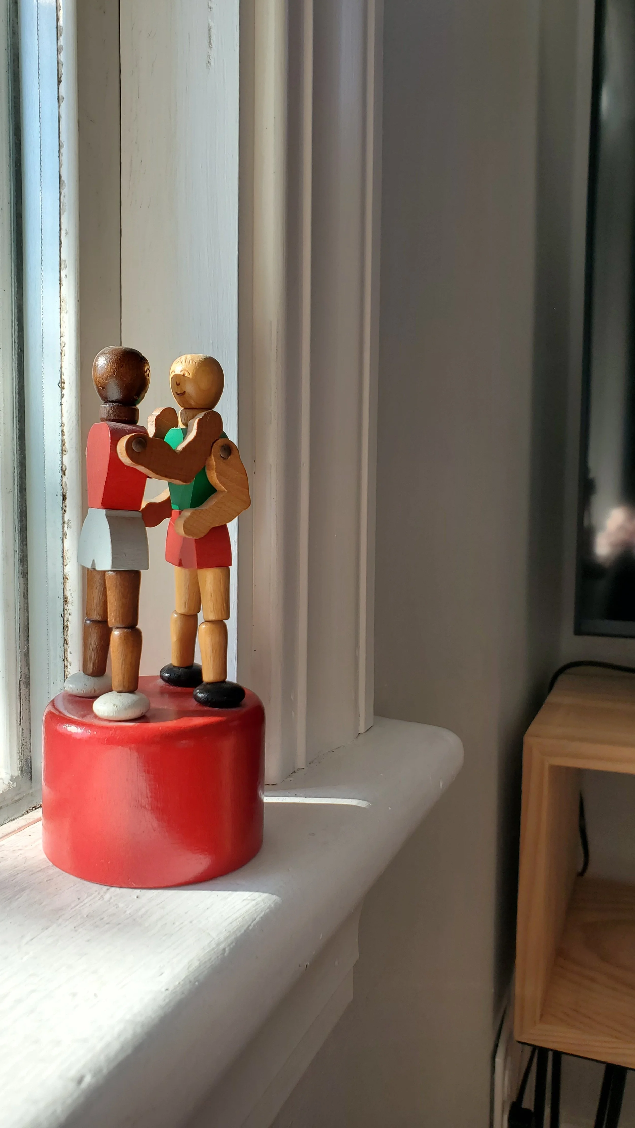
I’ll leave you with this adorable toy we added as a fun detail.
Although they may appear to be fighters, they look like they’re about to kiss.

